Tuesday, 3 May 2011
Thursday, 28 April 2011


Sunday, 27 February 2011
2 Music Magazine Double Page Spread Analysis
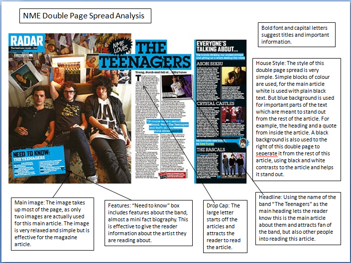
This is an analysis of a double page spread from a music magazine. This includes things about the colours and images used and explanation why they are used. In order to view this analysis larger please click on the image in order to make it bigger and more clear.

Monday, 7 February 2011
2 Music Magazine Front Cover Analysis
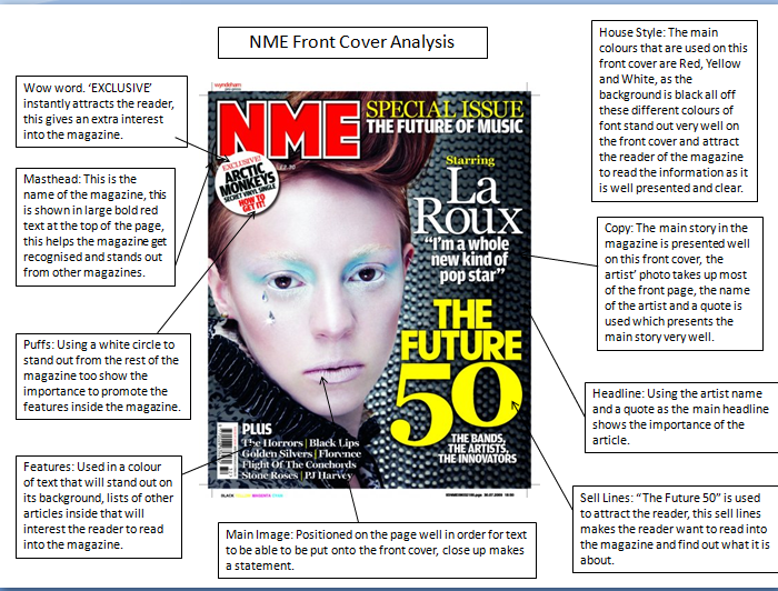
This is an analysis of a front cover of a music magazine. This includes things about the colours and images used and explanation why they are used. In order to view this analysis larger please click on the image in order to make it bigger and more clear.

Contents Page Mock-Up

This is my sixth form magazine mock up of a contents page for my magazine. This is includes a large text box which includes the information about the pages and what pages they can be found. This also includes two pictures and a puff to attract the reader. A main header is also used and the Deyes High Logo.
Thursday, 3 February 2011
Sixth Form Magazine Final Outcome
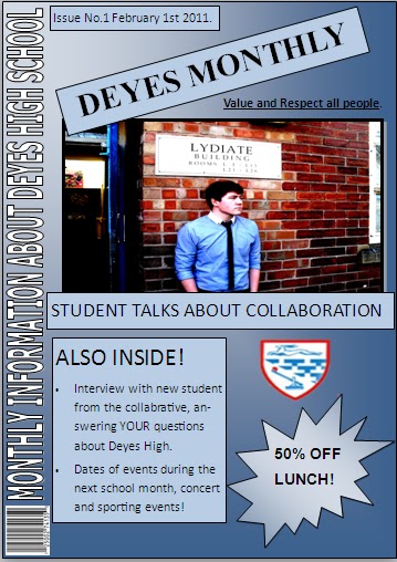
This is the final outcome of my Sixth Form Magazine. This relates to the previous design that i made for this magazine, everything is in the same position of which it was chosen to be on the design page. This magazine includes a Masthead 'DEYES MONTHLY' this instantly attracts the readers attention with the large font and bold text. A banner which runs down the side of the page with a slogan/sell line. A main image is used which is related to the Headline. 1 Puff is used in order to attract the attention of the reader, the colour of this contrasts to the background so that it stands out. There is a features box underneath the Header and Main Image. The semiotics that are used here is the colour blue. Blue is a bright and attractive colour and will instantly attract students attention. I used a slogan towards the top of the page 'Value and Respect all people' I used this as this is appropriate for the Deyes High Magazine, it is a good way too get students to show respect to eachother in and around school. The pug that is used is very simple at the top of the page, this simply states the date and issue number of the magazine. The second smaller image that I used is simply the Deyes High Logo, in order to make the magazine more relevent about the school. The final thing that i used was a Barcode in the bottom left corner, this makes the magazine look alot more proffesional and well put together.
Wednesday, 2 February 2011
Analysis of the same genre of magazine.

 This blog entry is too show the idea of a magazine of the same genre. Here i have uploaded to examples, they are both the magazine Kerrang, which include My Chemical Romance and Green Day. Therefore the genre for this music magazine is Rock. I will show the things that are the same about the house style of this magazine to show that magazines of the same genre generally have the same house style. The first thing that is similar about the magazines is the 'broken headline' this shows the masthead Kerrang to be 'broken' and 'shattered' this shows that this is a Rock magazine as it resembles anger and loudness. The semiotics are also similar, the colours yellow and red and pink are used in order to grab the viewers attention. These colours are used on things such as headlines and banners. The rest of the front cover is generally either white or black resembling the rock genre, therefore the colour contrast between this is useful. The general layout of images is the same for the magazine covers, everything is very packed together and cluttered around the page, again this suggests the Rock Genre, as it is very 'messy' and 'uncared for' almost resembling a Rock Concert? The text of the front covers suggests the genre to be very hard and bold, as block capitals and bold font is used.
 Sunday, 30 January 2011
Charter of Values.
Deyes High School Charter Of Values:
Commitment
Kindness
Forgiving Attitude
Value & Respect All People
Trust
Responsible For Your Own Actions
Fairness
Respect Other Peoples Property
Co-Operation
Honesty
Enthusiasm
Commitment
Kindness
Forgiving Attitude
Value & Respect All People
Trust
Responsible For Your Own Actions
Fairness
Respect Other Peoples Property
Co-Operation
Honesty
Enthusiasm
Semiotics
A theorist called Saussare stated that in everything there is a sign and signified. If sunshine and smiles is the SIGN then happiness is what has been signified.
Denotation - What you can see.
Connotation - What this might suggest.
Denotation - What you can see.
Connotation - What this might suggest.
Thursday, 27 January 2011
College Magazine Mock Up

This is a mock up of a college magazine that i have made on Microsoft Publisher. This includes Masthead, Banner, Images, Main Headline, Motto, Puffs, Sell Lines, Pugs, Features and Barcodes.
Thursday, 20 January 2011
Narcissistic identification

This is an image of Kerrang! Music Magazine front cover, with a picture of Biffy Clyro on the front.
Narcissistic identification demands identification with the object on the screen through the spectator's fascination with the recognition of his/her likeness.
Terminology
Buzz Words: "Wow", "Exclusive", "Free" are all examples of this.
Puffs: Colourful boxes promoting features inside.
House Style: A magazine's distinctive design that distinguishes it from its competitors.
Strap Line: A slogan
Banner: Text which stands out on a coloured background generally at the bottom of the magazine.
Copy: The Main Story in the Magazine
Anchorage Text: The way in which text helps to pin down the meaning of a picture and vice versa.
Pugs: Placed at the top left and right corners of the paper and are known as the 'ears' of the page. The price of the paper, the logo or a promotion are often positioned there.
Motto: Memorable phrase that is recognisable to a brand
Headline: Catchy Title for the main article
Sell Lines: Text on the front cover that helps to sell the magazine to the audience
Caption: Description of the main image
Masthead: Name of the magazine
Lead: The introductory paragraph of an article. Usually written in bold or capitals.
Drop Capitals: Really big letter that starts off an article
Wednesday, 19 January 2011
Male Gaze


Feminism in the media: Laura Mulvey' theory - Male Gaze
These are two photos of front covers of Music Magazines, Q and Rolling Stones which both include Lady Gaga. This is too show an idea of the Male Gaze, Voyeuristically and Fetishistically, which then leads onto Objectification of female characters in relation to the male gaze, and Narcissistic identification with a surreal image seen on the front cover.
Monday, 17 January 2011
Thursday, 13 January 2011
My chosen genre.
This is an image of pop star Lady Gaga, i have uploaded this image in order to show my chosen genre for my music magazine. I have chosen to do an Pop/Rock magazine, this is pop music but with can also involve dance beats and rock elements. This means guitars and synthesizers are used a lot within this genre, and i will show this in my music magazine. I will show this also by the use of props that i use within my magazine photos, such as costume and instruments.


Wednesday, 22 September 2010
First Media Blog
Hello and welcome to my AS media blog!
On here, i will be updating my work and keeping track on the work that i do.
My blog will include an number of different analysis, this will include such things as music magazine front covers, contents page and double page spreads, each of these will have 2 different anylisis. Another type of anaylisis that will be included is one of a front cover.
I will then be creating a draft mock up of a college magazine front cover, the content page for this magazine and then i will justify my choices.
For the organisation, i will be creating mood boards in order to design my magazine, a production schedule will be made in order to organise when i will be completing certain tasks within this.
Venue forms will have to be completed in order too take the photographs that i need for my magazine, i will have to get full confirmation from the owner of the property that i can use there land in order to take my photographs.
Risk Assesment forms will also have to be completed in order too make sure my "model" is safe on the photoshoot, and that they know the risks that they may have to take.
When it comes to making a draft for my magazine, i will be creating a front page, contents page and double spread mocks up so that i know what my magazine is going too look like, and also so that i can have different options in what my final design is going too look like.
Photoshop practices will then be included onto my blog so that all my photos are of a high quality for my magazine front covers and double page spread. Mock photographs will then be taken so that i have a choice of photos for my final magazine.
Subscribe to:
Posts (Atom)