This is an analysis of a double page spread from a music magazine. This includes things about the colours and images used and explanation why they are used. In order to view this analysis larger please click on the image in order to make it bigger and more clear.
Sunday, 27 February 2011
Monday, 7 February 2011
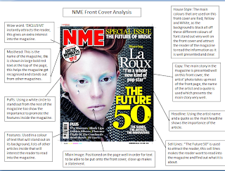
2 Music Magazine Front Cover Analysis
This is an analysis of a front cover of a music magazine. This includes things about the colours and images used and explanation why they are used. In order to view this analysis larger please click on the image in order to make it bigger and more clear.
Contents Page Mock-Up
This is my sixth form magazine mock up of a contents page for my magazine. This is includes a large text box which includes the information about the pages and what pages they can be found. This also includes two pictures and a puff to attract the reader. A main header is also used and the Deyes High Logo.
Thursday, 3 February 2011
Sixth Form Magazine Final Outcome
This is the final outcome of my Sixth Form Magazine. This relates to the previous design that i made for this magazine, everything is in the same position of which it was chosen to be on the design page. This magazine includes a Masthead 'DEYES MONTHLY' this instantly attracts the readers attention with the large font and bold text. A banner which runs down the side of the page with a slogan/sell line. A main image is used which is related to the Headline. 1 Puff is used in order to attract the attention of the reader, the colour of this contrasts to the background so that it stands out. There is a features box underneath the Header and Main Image. The semiotics that are used here is the colour blue. Blue is a bright and attractive colour and will instantly attract students attention. I used a slogan towards the top of the page 'Value and Respect all people' I used this as this is appropriate for the Deyes High Magazine, it is a good way too get students to show respect to eachother in and around school. The pug that is used is very simple at the top of the page, this simply states the date and issue number of the magazine. The second smaller image that I used is simply the Deyes High Logo, in order to make the magazine more relevent about the school. The final thing that i used was a Barcode in the bottom left corner, this makes the magazine look alot more proffesional and well put together.
Wednesday, 2 February 2011
Analysis of the same genre of magazine.

 This blog entry is too show the idea of a magazine of the same genre. Here i have uploaded to examples, they are both the magazine Kerrang, which include My Chemical Romance and Green Day. Therefore the genre for this music magazine is Rock. I will show the things that are the same about the house style of this magazine to show that magazines of the same genre generally have the same house style. The first thing that is similar about the magazines is the 'broken headline' this shows the masthead Kerrang to be 'broken' and 'shattered' this shows that this is a Rock magazine as it resembles anger and loudness. The semiotics are also similar, the colours yellow and red and pink are used in order to grab the viewers attention. These colours are used on things such as headlines and banners. The rest of the front cover is generally either white or black resembling the rock genre, therefore the colour contrast between this is useful. The general layout of images is the same for the magazine covers, everything is very packed together and cluttered around the page, again this suggests the Rock Genre, as it is very 'messy' and 'uncared for' almost resembling a Rock Concert? The text of the front covers suggests the genre to be very hard and bold, as block capitals and bold font is used.
Subscribe to:
Posts (Atom)


